Skip to content →

Category: brand

Shadows in the Crevices of CRM and VRM

Two sides of an equation, or perhaps mirror images. Narcissus bent over the glimmering pool of water trying to catch a glimpse. CRM and VRM attempt hyperrealist representations of humanity. There’s a reduced set of data about a person that describes their propensity to transact in a certain way. The vendor keeps this record in their own private, secure space; constantly sifting through the corpus of data looking for patterns that might change the probabilities. The vendor expends a measured amount of energy nudging the humans represented by each data record toward a configuration of traits that tumble over into a transaction.

Reading Zadie Smith‘s ruminations on the filmThe Social Network” in the New York Review, I was particularly interested in the section where she begins to weave the thoughts of Jaron Lanier into the picture:

Lanier is interested in the ways in which people ‘reduce themselves’ in order to make a computer’s description of them appear more accurate. ‘Information systems,’ he writes, ‘need to have information in order to run, but information underrepresents reality (Zadie’s italics).’ In Lanier’s view, there is no perfect computer analogue for what we call a ‘person.’ In life, we all profess to know this, but when we get online it becomes easy to forget.

Doc Searls’s Vendor Relationship Management project is to some extent a reaction to the phenomena and dominance of Customer Relationship Management. We look at the picture of ourselves coming out of the CRM process and find it unrecognizable. That’s not me, I don’t look like that. The vendor has a secured, private data picture of you with probabilities assigned to the possibility that you’ll become or remain a customer. The vendor’s data picture also outputs a list of nudges that can be deployed against you to move you over into the normalized happy customer data picture.

VRM attempts to reclaim the data picture and house it in the customer’s own private, secure data space. When the desire for a transaction emerges in the customer, she can choose to share some minimal amount of personal data with the vendors who might bid on her services. The result is a rational and efficient collaboration on a transaction.

The rational argument says that the nudges used by vendors, in the form of advertising, are off target. They’re out of context, they miss the mark. They think they know something about me, but constantly make inappropriate offers. This new rational approach does away with the inefficiency of advertising and limits the communication surrounding the transaction to willing partners and consenting adults.

But negotiating the terms of the transaction has always been a rational process. The exchange of capital for goods has been finely honed through the years in the marketplaces of the world. Advertising has both a rational and an irrational component. An exceptional advertisement produces the desire to own a product because of the image, dream or story it draws you into. Irrational desires may outnumber rational desires as a motive for commercial transactions. In the VRM model, you’ve already sold yourself based on some rational criteria you’ve set forth. The vendor, through its advertising, wants in to the conversation taking place before the decision is made, perhaps even before you know whether a desire is present.

This irrational element that draws desire from the shadows of the unconscious is difficult to encode in a customer database profile. We attempt to capture this with demographics, psychographics and behavior tracking. Correlating other personal/public data streams, geographic data in particular,  with private vendor data pictures is the new method generating a groundswell of excitement. As Jeff Jonas puts it, the more pieces of the picture you have the less compute time it’ll take to create a legible image. Social CRM is another way of talking about this, Facebook becomes an extension of the vendor’s CRM record.

So, when we want to reclaim the data picture of ourselves from the CRM machines and move them from the vendor’s part of the cloud to our personal cloud data store, what is it that we have? Do the little shards of data (both present and represented through indirection) that we’ve collected, and release to the chosen few, really represent us any better? Don’t we simply become the CRM vendor who doesn’t understand how to properly represent ourselves. Are we mirror images, VRM and CRM, building representations out of the same materials? And what would it mean if we were actually able to ‘hit the mark?’

Once again here’s Zadie Smith, with an assist from Jaron Lanier:

For most users over 35, Facebook represents only their email accounts turned outward to face the world. A simple tool, not an avatar. We are not embedded in this software in the same way. 1.0 people still instinctively believe, as Lanier has it, that ‘what makes something fully real is that it is impossible to represent it to completion.’ But what if 2.0 people feel their socially networked selves genuinely represent them to completion?

I sense in VRM a desire to get right what is missing from CRM. There’s an idea that by combining the two systems in collaboration, the picture will be completed. We boldly use the Pareto Principle to bridge the gap to completion, 80% becomes 100%; and close to zero becomes zero. We spin up a world without shadows, complete and self contained.

From T.S. Eliot’s The Hollow Men

Between the idea
And the reality
Between the motion
and the act
Falls the Shadow

For Thine is the Kingdom

Between the conception
And the creation
Between the emotion
And the response
Falls the Shadow

Life is very long

Between the desire
And the spasm
Between the potency
And the existence
Between the essence
And the descent
Falls the Shadow

For Thine is the Kingdom

For Thine is
Life is
For Thine is the

This is the way the world ends
Not with a bang but a whimper.

3 Comments

Fashion: A Remix Economy

Listening to Russ Roberts of EconTalk discuss his wardrobe and his relative cluelessness with regard to fashion, my thoughts turned to software engineers. I wondered if both economists and software engineers believe that there’s some kind of optimization algorithm for selecting clothing.

In an episode of EconTalk, Johanna Blakely talks with Roberts about how the lack of copyright protection in the fashion industry turns it into an economy of continuous innovation. There are some interesting lessons here regarding the relationship between originals and copies, remixing and the circulation of design motifs.

Download EconTalk: Johanna Blakely on Fashion and IP

Somehow it seems unlikely that the technology/media business will look to fashion as an inspiration for viable business models. But it’s clear they could learn a thing or two. As you look across the landscape of technology companies, only Apple (despite the fact that Jony Ive never changes his T-shirt), has managed to create a release cycle that in many ways mirrors the major fashion houses. They release new designs annually and then watch the knock-off shops go to work trying to replicate their products. And like the top fashion houses, Apple is driven to be creative, to set the next trend that puts them one step ahead.

The fashion world still honors and rewards the creators of fresh and original looks. Since there’s no regulatory friction hindering fast followers with good-enough copies, the market is filled with cheap knock-offs. Both seem to survive in the ecosystem. One reason for this is that the copies are not digital— they aren’t exact atom-for-atom copies of the originals. Generally, to lower the price of the knock-off, the materials have to be cheaper. In the world of bits, exact replication is just a matter of a few key strokes. There’s no such thing as cheaper or more expensive bits. One of the more interesting trends in fashion is the designer who copies herself. Rather than cede the low-end knock-off market, the designer executes low-end copies of her signature styles for mass distribution through the fast-fashion retailers.

You can learn a lot about the economics of the technology business by simply viewing each of the major vendors as a fashion house.

Comments closed

Nexus One, iPhone and Designing For Sustainability

The technology news streams have been filled with coverage of the new Google phone called the Nexus One. It’s impact will be significant. Now there are two “phones” in the new landscape of mobile computing. Two are required to accelerate both innovation and diffusion of the technology. The Nexus One will both spur, and be spurred on by, the iPhone.

Much of the coverage has focused on comparisons of the two devices with regard to feature set and approach to the carriers. On the product strategy side, the story of the early Macintosh vs. Windows battle is being replayed by the pundits with Google cast in the role of Microsoft, and Android as the new Windows. The conventional wisdom is that Apple lost to Microsoft in the battle of operating systems, and that history will repeat itself with the iPhone.

A quick look at the top five U.S. companies by market capitalization shows Microsoft, Google and Apple holding down three of those spots. Apple’s so-called losing strategy has resulted in a market cap of $190 Billion and a strong, vibrant business. If history repeating itself leads to this kind of financial performance, I’m sure Apple would find that more than acceptable.

But it was watching Gary Hustwit’s film Objectified that brought forward a comparison that I haven’t seen in all the crosstalk. Following up his film, Helvetica, which documented the history of the typeface, Hustwit takes a look at the world of industrial design and designers:

Objectified is a feature-length documentary about our complex relationship with manufactured objects and, by extension, the people who design them. It’s a look at the creativity at work behind everything from toothbrushes to tech gadgets. It’s about the designers who re-examine, re-evaluate and re-invent our manufactured environment on a daily basis. It’s about personal expression, identity, consumerism, and sustainability.

Industrial design used to be about designing the look and feel of a product— the designer was brought in to make it pretty and usable. Now the whole lifecycle of the product is considered in the design process. I’ve found John Thackara’s book In The Bubble, and Bruce Sterling’s Shaping Things to be very eloquent on the subject. Looking beyond how the phone works for the user, there’s the environmental impact of the industrial manufacturing process and disposing of the phone at the end of its life.

It was Craig Burton’s Choix Vert Action Card that brought Apple’s policies on industrial design and the environment into view for me. While searching Google for something related to Apple, the Choix Vert card adds a thumbprint logo to socially responsible companies on the results page. Apple sports the Choix Vert mark, HTC, producer of the Nexus One, doesn’t. Currently Apple provides environmental impact reports for each of their products. Apple’s so-called ‘closed’ approach to their products results in a unique ability to control, not only the user experience, but how the product is manufactured, and what happens at the end of its life.

Google’s modular approach to their phone means they can claim they aren’t responsible for manufacturing or disposal. The Android phone run-time will be put on a variety of phones with manufactured by companies with varying degrees of social responsibility.

Early reports from users indicate that the Nexus One’s user interface could use a little more polish. I expect that will happen as the software is iterated and the user experience refined. But beyond feature sets and carrier costs, I hope Nexus One users will ask Google about the environmental impact of their phone.

Every year about 130 million cellphones are retired, for every Nexus One that’s purchased, it’s likely that another cell phone will go out of service. Google is now in the consumer hardware business, and that brings with it some responsibilities they aren’t used to considering. Given their corporate motto, I’m sure they’ll do the right thing.

http://en.wikipedia.org/wiki/Product_lifecycle_management
2 Comments

Ornamentation: The Beauty of Search

tongue-tattoo1

It began with a discussion of ornamentation. As we look around us, the ornament seems to be disappearing. The things we use have been stripped of ornamentation in favor of pure functionality. Form, we are taught, must follow function. Decoration is an unnecessary expense, as it adds nothing to the function of a manufactured thing. Ornament has lost the battle of Return on Investment.

It wasn’t always so, there was a distinct turn. Alain De Botton, in his book “The Architecture of Happiness” explores the moment when engineering and aesthetics collided.

“The answer that eventually emerged was not really an answer; rather, it was an admonishment that it might be irrelevant and even indulgent to raise the question in the first place.

A prohibition against discussions of beauty in architecture was imposed by a new breed of men, engineers, who had achieved professional recognition only in the late eighteenth century, but had thereafter risen quickly to dominanace in the construction of the new buildings of the Industrial Revolution.”

These engineers were building the factories, bridges and railways that would provide the infrastructure for the industrial age. Style simply wasn’t a consideration.

“The philosophy of the engineers flew in the face of everything the architectural profession had ever stood for. ‘To turn something useful, practical, functional into something beautiful, that is architecture’s duty,’ insisted Karl Friedrich Schinkel. ‘Architecture, as distinguished from mere building, is the decoration of construction,’ echoed Sir George Gilbert Scott.

The essence of great architecture was understood to reside in what was functionally unnecessary.”

In 1923, Le Corbusier penned a book called ‘Toward a New Architecture‘ which outlined the principles of this new approach to the design of buildings. Again, from De Botton’s book:

For Le Corbusier, true, great architecture — meaning, architecture movtivated by the quest for efficiency — was more likely to be found in a 40,000-kilowatt electricity turbine or a low-pressure ventilating fan. It was to these machines that his books accorded the reverential photographs which previous architectural writers had reserved for cathedrals and opera houses.

And with that prelude, we arrive at the web search engine and the use and meaning of ornament. There’s an interesting experiment currently being conducted called Blind Search. The creators of this test wonder what happens to a user’s perception of search results when all branding is removed. Google initially established itself by producing noticeably better search results. Now, established as a verb meaning “to search,” does Google still provide results that are visibly superior? The results indicate that Google still leads, but not by as much as you’d think: Google: 41%, Bing: 31%, Yahoo: 28%. And putting the Google brand on any search results increases satisfaction.

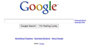
google_screenshot

In looking at the design of the Google user interface, we see the influence of Le Corbusier. The typographic logo is the only design on the page, and occasionally it is playfully re-imagined to commemorate notable events. Here, form follows function.

In his book, De Botton tries to articulate how we find beauty— the mechanics of what attracts us:

“We can conclude from this that we are drawn to call something beautiful whenever we detect that it contains in a concentrated form those qualities in which we personally, or our societies more generally are deficient. We respect style which can move us away from what we fear and towards what we crave: a style which carries the correct dosage of our missing virtues.”

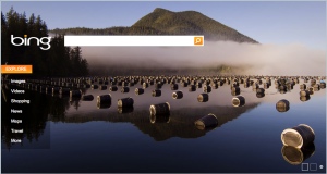
While we may perceive the Network as vast, complex and opaque— with its simplicity Google’s design provides us with the antidote. Now look at this image of Microsoft’s Bing home page:

bing_screenshot

Bing’s user interface is decorated with a background image that gives a sense of what it does. I’m fairly certain that the image has no effect on the quality of the search results. Bing is attempting to provide a usage model for the consumption of faceted search results. Queries return both potential facets along with the traditional list of links. Bing is designed with both facets and links in mind, while Google appends facets to the bottom of the link list.

As the facets and links that search engines return become more and more indistinguishable, what is the difference that will make a difference? One could assume that there will always be an engineering innovation right around the corner that will make a significant and visible difference. We like to believe that progress is always linear.

Corporate brand clearly makes a difference, users like a brand name search product. Microsoft’s brand has been held in the background and a new brand has been established. Images have also been used to distinguish Bing. Ornamentation has been exiled for so long, it’s hard to understand how to even value it.

Let’s return again to Alain De Botton:

The buildings we admire are ultimately those which, in a variety of ways, extol values we think worth wile — which refer, that is, whether through their materials, shapes or colours, to such legendarily positive qualities as friendliness, kindness, subtlety, strength and intelligence. Our sense of beauty and our understanding of the nature of the good life are intertwined. We seek associations of peace in our bedrooms, metaphors for generosity and harmony in our chairs, and an air of honesty and forthrightness in our taps. We can be moved by a column that meets a roof with grace, by worn steps that hint at wisdom and by a Georgian doorway that demonstrates playfulness and courtesy in its fanlight window.

Le Corbusier’s aesthetic demanded design be “ascetic and clean, disciplined and frugal.” He had a hatred of any kind of decoration. Google’s engineering aesthetic is a terminal design. Any competitor employing a purely functional design will unintentionally be referencing Google. There’s no way to get radically simpler than Google, and therefore no way to create enough space to allow for differentiation. The only alternative is to move back into ornament, into the decorative, into beauty.

jean_arp

While we may think of computerized search of the internet as a purely functional affair of ONEs and ZEROs, the simple lists of links are being pulled into organic forms by their facets. Human forms of life are surfacing in and through our search queries. Search results will begin to bloom into something that looks much more like a natural form than points and lines in a frictionless space. This moment may mark another turning point…

Comments closed